


How UI/UX design has shaped the vision for iCabbi’s brand new Passenger App
Passenger Experience is a passion for the whole iCabbi dev team in Montreal. We’ve been innovating in the taxi technology space for over 5 years and are pretty much obsessed with pushing the boundaries of what can be done to help taxi companies operate efficiently and give their customers a better experience. So, the new iCabbi Passenger App is kind of our baby, and we’re working all the time to improve it. In fact, every two weeks we release upgrades and enhancements to the product.
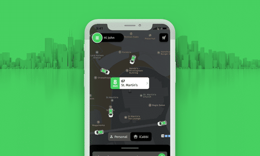
This month sees an especially big release for the Passenger App as we’re now launching a complete redesign of the App. You will be able to see the benefits immediately. It really is 10X, and we’re very excited to share it with all of our customers, and their customers, of course!
In this article I want to explain our new, improved app design and features and the UI/UX development mentality and process that has underpinned its construction, and continues to drive innovation forward at iCabbi.
Background
I guess the first question to address is why have we redesigned the app given that it is so new to the market?
Almost a year ago, we were pushing for the last miles of development to finish up the iCabbi Passenger App to be showcased at Accelerate 2020 in Dublin. As the team and I watched the live stream of the event, I could feel the rollercoaster of emotions that the team went through, from anxiety to joy. The demo, as well as the whole conference, were a success!
Then came the feedback from our customers and users. Some confirmed our assumptions, some pointed out functionality that we hadn’t considered as a priority, and some ideas made us think! Feedback and collaboration are crucial to product development.
Even though our app was a success at Accelerate 2020, we had many ideas to make it even better. We added features and functionalities to meet market needs, but knew it would take more than just this to wow the users. To lead the way it takes innovation, a vision, an understanding of our customers’ users and ultimately go beyond the functional expectations. Our aim now is to exceed expectations – and that’s exactly what the new look and design will do.
Using Data in Design
The focus of the first version of the Passenger App was getting the happy conversion path right. Our effort went into designing an app that provides companies customers a solution to their problems – increasing conversions and engagement, eliminating pain-points, and reducing friction. Understanding the passenger journey was at the heart of design and development concerns.
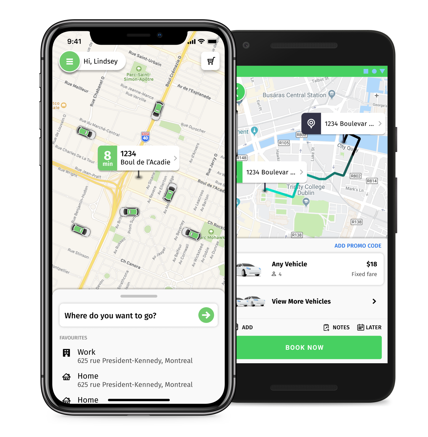
With data learning we are able to shape the user journey. As an example, data has shown that in the last 90 days, 31.5% of bookings have been made through users’ favourites, 60% are from the “Address” screen and 40% from the “Home” screen. With favourites a user can create a booking in 2 taps, most importantly is that the user engages with the app by adding favourites.
The core experience of our Passenger App was straightforward and solid. Within 30 seconds, a new user can create an account, book a trip and wait for his driver to pick them up. However, we felt that something was missing. A redesign of the iCabbi Passenger app would allow us to enhance the overall app experience with a better user interface and animations. We would also add some new features and improve on some of the existing ones. One could say that the app has grown from a Minimum Viable Product to Minimum Awesome Product.
The value of Visual Design
Visual design is more than just eye candy. Studies have shown that users will make a judgment of a product within the first 50 milliseconds of their first interaction with it, thus demonstrating why the first impression of your product is so important: it could be the last.
Visual design is also the strongest tie a brand has with its consumer. It’s a way of communicating with users. Done efficiently, users will understand and learn how your product works for them. A playful experience should increase a users’ engagement and loyalty.
Our Design Process
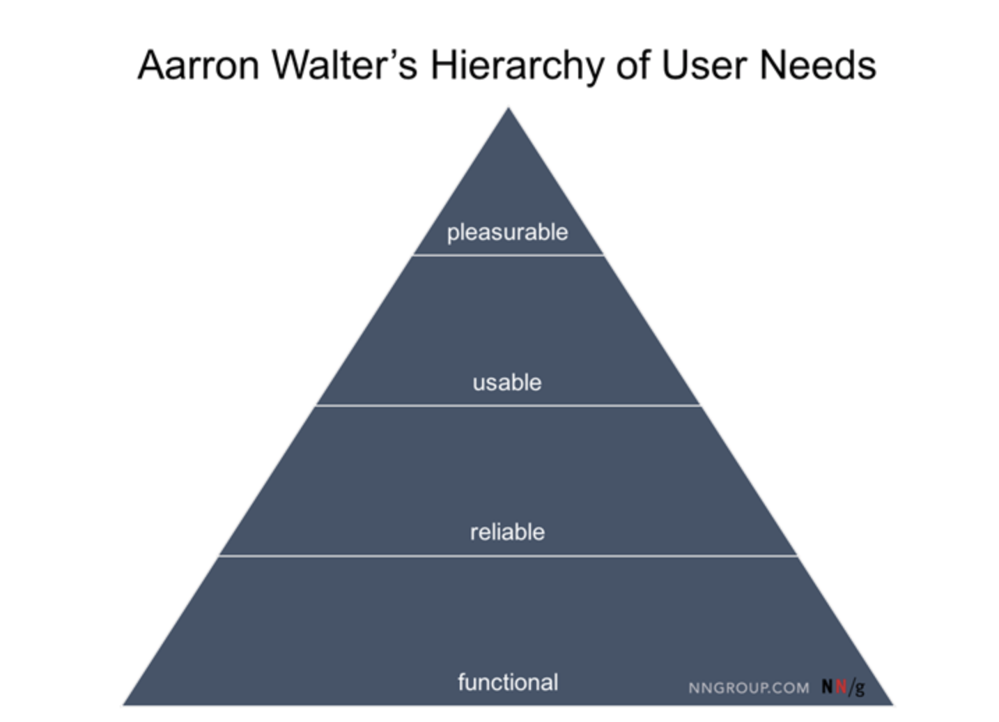
Through mood boards, competitive landscape research, and user feedback, a visual design direction is agreed. Early in 2020 iCabbi went through a rebranding process and this helped to springboard part of the design decisions. The target was set on taking a reliable (but slightly plain) app towards becoming a more pleasurable user experience with both a consistent design and clear visual hierarchy on every screen.
I can’t count how many times I went back to the drawing board before the final design was approved. Part of the creative process is to take feedback from everyone, juxtapose it with our goals, and see how it fits in the scheme of “who we’re designing this app for”.
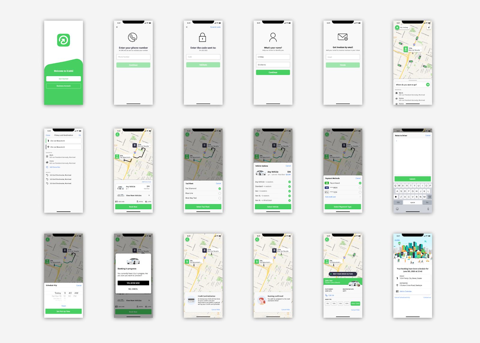
Key Elements of the new Design
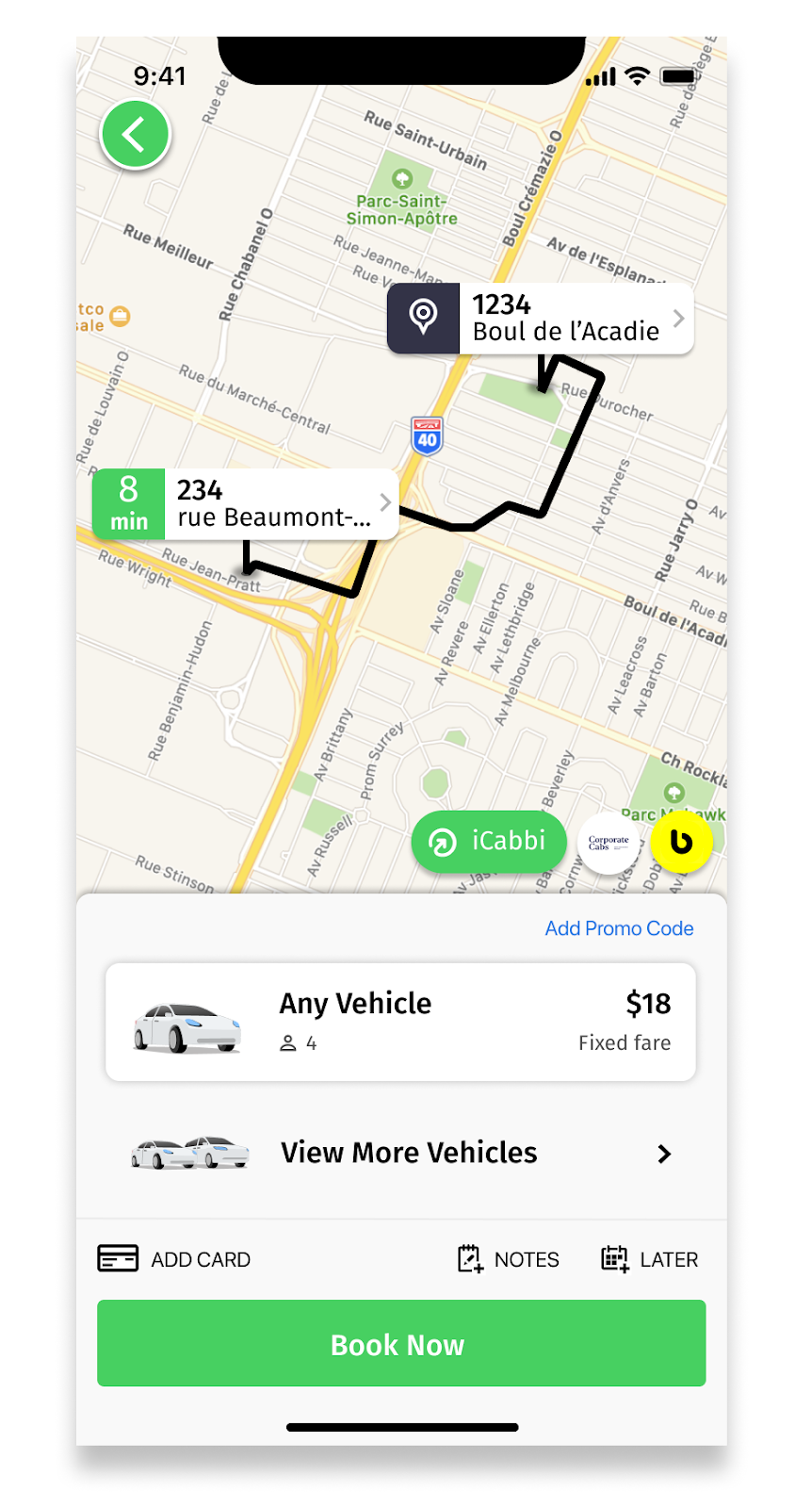
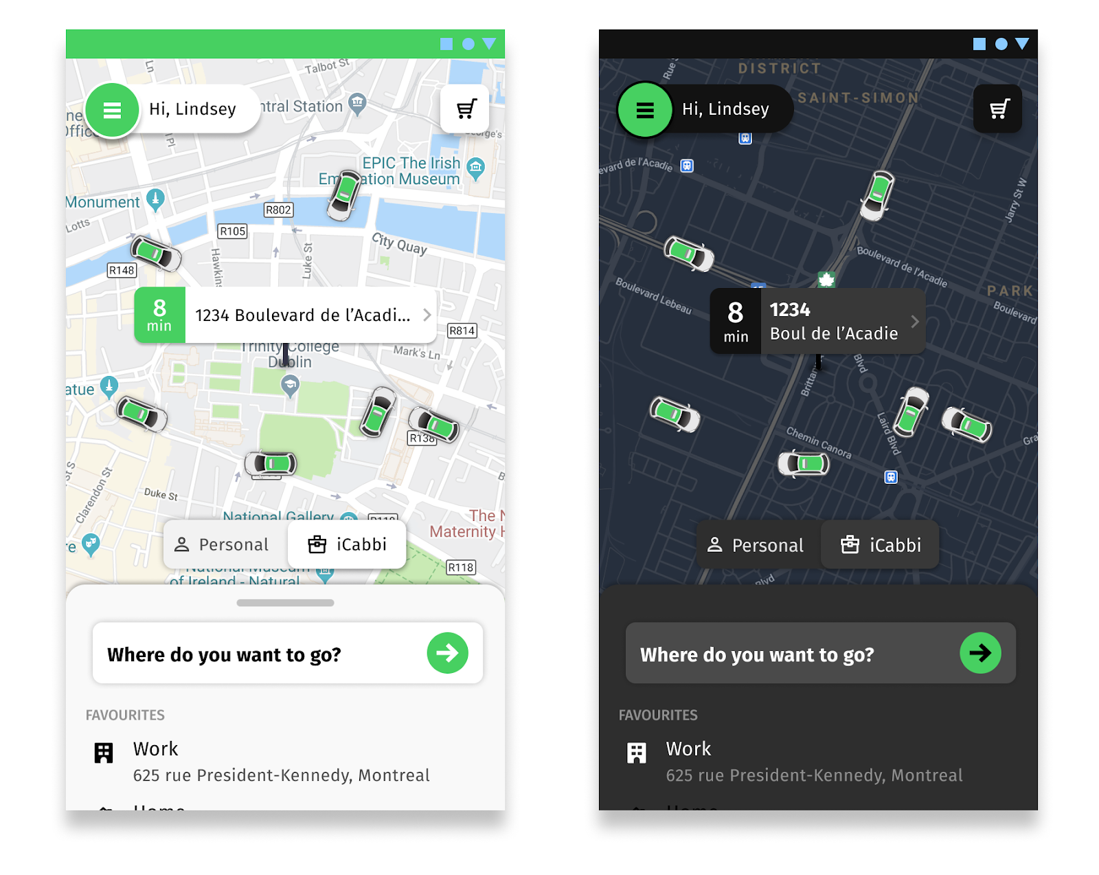
Simplicity & Symmetry
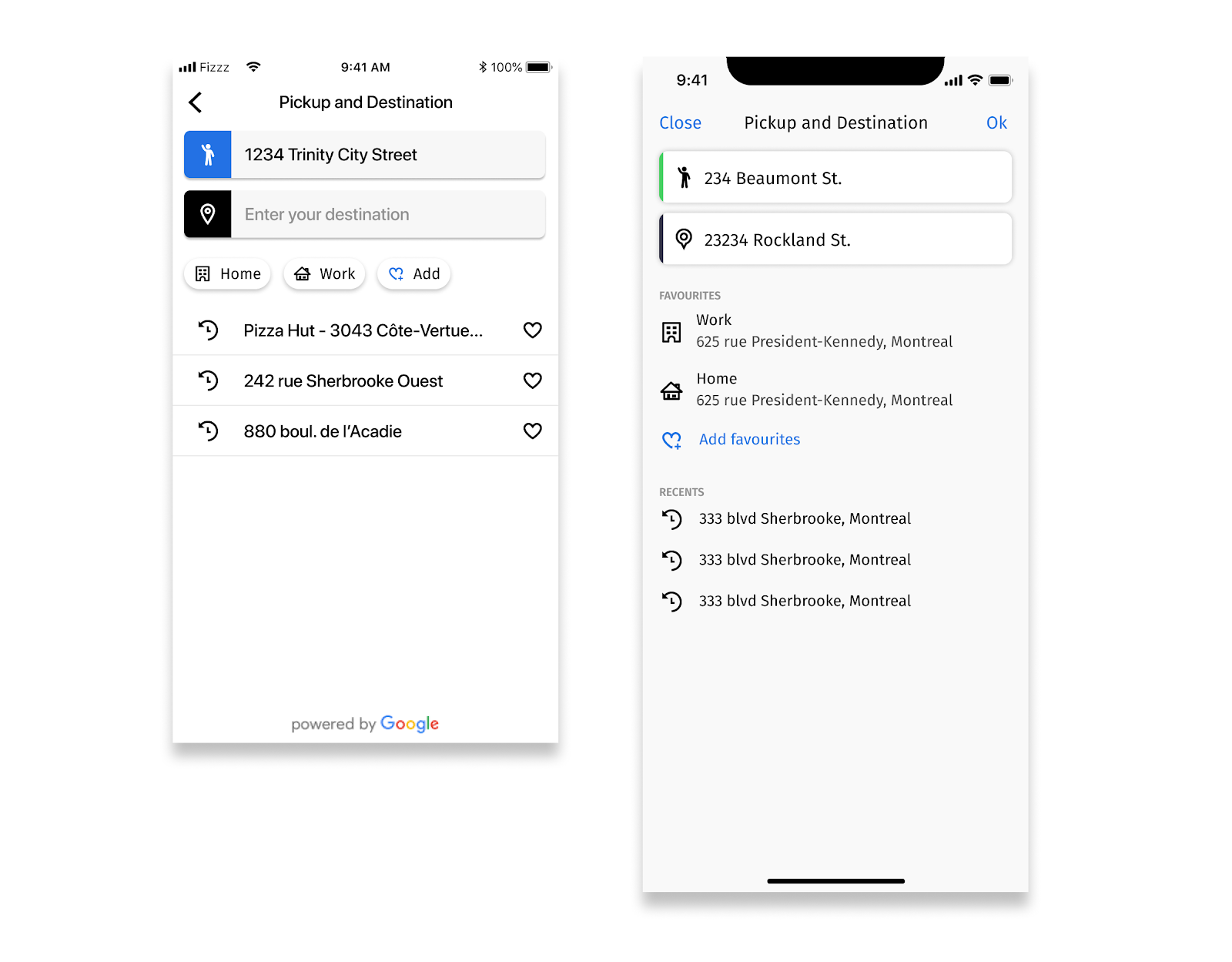
Users’ expectations from a taxi app are simplicity and reliability of the service. When developing a visual interface for a mobile app, simplicity and symmetry are the golden rules to follow when presenting information effectively. Our app is therefore designed in such a way that the user is asked to perform only one main action per screen. This lessens the cognitive load on a user, and if done properly, the user will feel that booking a trip is a breeze. Our efforts were mainly focused on creating a visually balanced design through symmetry as it directs the users’ attention and adds a sense of stability which is desirable for eCommerce apps.
Colour
Since we are building a white-label app, we take our customers’ brand to heart by making sure their colours are respected and sufficiently represented in the app. Studies have shown that certain colours can have an impact on performance. Most often our customer colours are unknown to us and there’s little we can do about it. Some customers have great logos and screen friendly colours and others don’t. Our playbook in creating an aesthetically customizable app was therefore to use brand colours as accent rather than lead colours on actionable visual elements, such as the main call-to-action button.
Typography
Typography also plays a major role in aesthetics, usability, and accessibility. The new font, Fira Sans, is elegant, responsive and legible on smartphones in dark and light mode. It also ties up our brand across all of the iCabbi products.
Animation and Movement
Storytelling with animation and micro-interaction
Shimmering Effect and content fades into the screen
A full redesign of the app won’t be complete without the big little details. Animation and micro-interaction are often left out in the design process. Using the map as the centerpiece and background of our app, it was necessary to create a harmonious flow when the user navigated in our app. As the user goes from screen to screen, elements of the interface appear on top of the map, it guides the user to focus on important elements of the page. Micro-interaction are helpful to give feedback to the user on his action through loading status and animation when they tap on a button.
Accessibility
Inclusiveness is important at iCabbi. Taxi companies need to provide accessible services to their customers, and this means providing adaptable technology that makes booking and taking a taxi trip as easy as possible for people with differing needs. The new Passenger App has improved it’s accessibility for every user, including those with special needs.
- The user interface is able to render various font sizes and colours to support people with low vision and colour blindness.
- Voiceover is supported to help users who are blind or visually impaired.
- Dark mode is also available on both iOS and Android, it makes the interaction easier on the eyes in low lighting conditions.
Conclusion
There’re many pieces and members in creating an app from the project manager to developers and QA, everyone has their say in the process. Design is not everything but it’s an important part of a well-thought-out product. It communicates with the users and is something that users generally find very comforting, engaging, and desirable. For now, I hope you all appreciate the new design and trust that we will endeavour to always keep making it better. Our goal is always to exceed expectations.